12 column layout in CSS Grid
 Andrey Kovtun at2 min read
All my personal projects I try to develop without redundant entities like Bootstrap and other overbloated CSS frameworks. The less unused styles on a page, the better the performance.
But what should I do if my project requires Bootstrap's 12-column grid? At the current state of CSS, we do not want to pull Sass grid frameworks like SmartGrid into our projects. With the introduction of CSS Custom Properties (also known as CSS Variables), Sass-like preprocessors can also be considered obsolete.
How to use
We can use CSS Grid Layout, which can already be used in browsers (IE RIP).
Let's look at this simple structure:
<div class="grid">
  <div class="grid__item--main">Main</div>
  <div class="grid__item--sidebar">Sidebar</div>
</div>
.grid {
display: grid;
gap: 20px;
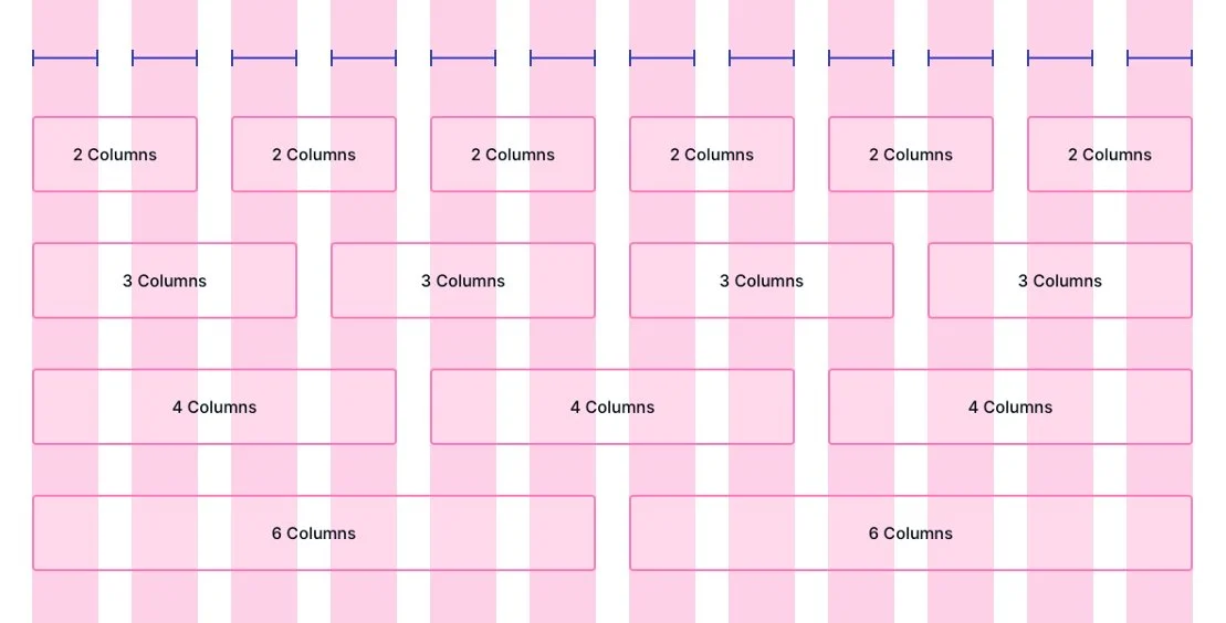
grid-template-columns: repeat(12, minmax(0, 1fr));
}
Note that I am using the gap property instead of grid-gap, which is considered deprecated.
Now let's apply a hack to equalize the width of the grid elements.
Elements with percentage width put inside the Grid Layout, count percentages from the line width, not from the container width. Therefore, you need to add to the elements:
[class^='grid__item--'] {
  width: auto;
}
Now we can define the width in columns for the grid elements.
.grid__item--main {
  grid-column: span 8; /* 8 columns */
}

.grid__item--main {
  grid-column: span 4; /* 4 columns */
}
For mobile devices, we can use Media Queries.
@media (width <= 640px) {
  .grid__item--main {
    grid-column: span 12; /* 12 columns */
  }

  .grid__item--main {
    grid-column: span 12; /* 12 columns */
  }
}
The grid-column property is of course more complex, it can do various interesting things. But in the context of a 12-column grid, span will be enough for us.
What about ancient browsers?
If you need a fallback for older browsers, you can use Feature Queries with Flexbox (or heaven forbid Inline Blocks).
@supports (display: grid) {
  .grid {
    display: grid;
  }
}
References: